
TYPE AWARENESS
SARAH HYNDMAN - TYPE TASTING
How Fonts Impact Meaning
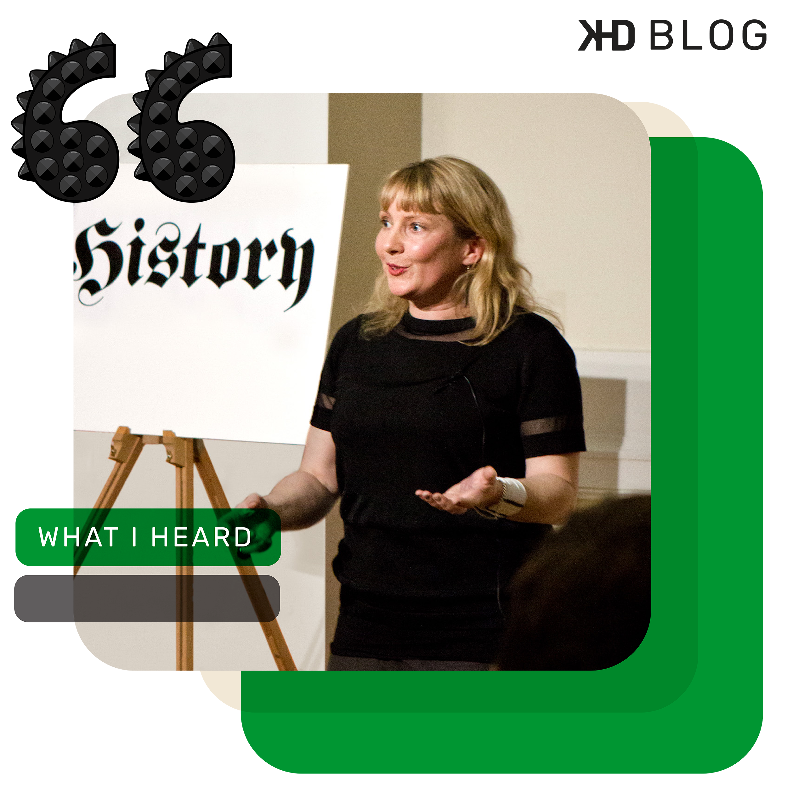
Sarah Hyndman, the graphic designer, researcher, author, and founder of Type Tasting, opened her Adobe Max session with a thought-provoking question: “Have you ever said something only to get a slightly shocked reaction because your intended meaning was completely misconstrued?” This set the stage for her exploration of how typography shapes our understanding of words.
For over a decade, Sarah has run mass participation typography experiments, uncovering surprising insights. In her Typographic Awareness session, she shared her work with Professor Charles Spence from Oxford University and the research behind her best-selling book, Why Fonts Matter. Through her experiments, Sarah demonstrates how typography influences not just how we read, but how we feel, think, taste, and act.
Her work reveals that fonts do more than just convey words—they shape emotional responses, perceptions, and even sensory experiences. Sarah creates interactive experiences that allow audiences to feel the power of typography firsthand, showing how subtle design choices can dramatically alter the meaning and impact of a message.
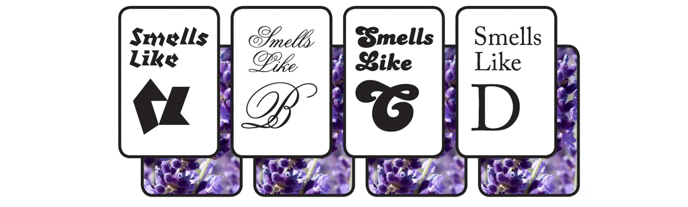
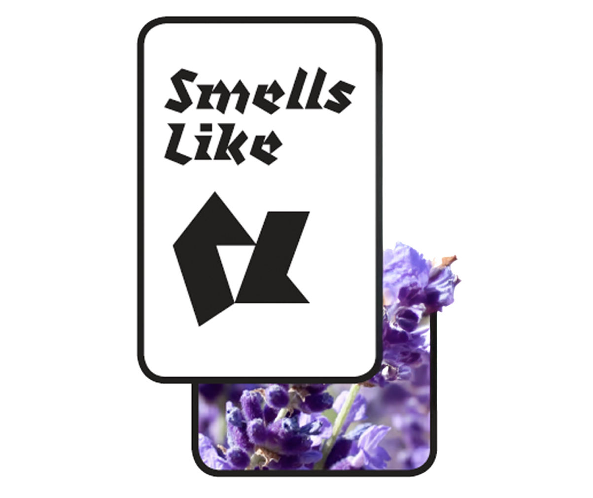
The below deck of cards features Sarah's lavender scratch-and-sniff cards. Can you imagine what they smell like? Which card do you think most strongly evokes the scent of lavender? Sarah guesses that you thought of either B or D. Is she right? If so, it might suggest that the shapes of these letters, when paired with lavender, create a mood that feels both pleasant and a bit old-fashioned. Of course, there’s no wrong answer. Maybe you chose A or C instead? Later, we’ll discuss why three people in one of the experiments picked a surprising letter.
How do humans interact with and interpret words?
Humans make assumptions at first sight. Our ancestors needed to know how quickly whether something was safe or dangerous. The brain finds patterns in what we see and mixes them up across all our senses and uses these to make predictions. In today’s world we make predictions of the appearance of words, without even noticing that we are doing it. We only notice when it’s gone wrong. For example, Gaps infamous 2010 rebrand (that only lasted one week) or the Tropicana rebrand (that lost lose $20 million in sales). In more recent years is the brandification of logos all looking the same.
One day while Sarah was shopping in a UK grocery store with her friend Miho they stumbled across an American food aisle. Miho being from Michigan was excited to see all the packaging, so much so they prompted her to tell Sarah of memories of family and birthdays. But for Sarah growing up in the Uk the packaging didn’t prompt any feelings or memories.
We gather an ever-expanding collection of associations from the experiences we have. These memories shape our interpretation of meaning. Like teaching a child to talk and read is the initial stage of rewiring their brains. Our brains don’t arrive in a box preinstalled with software. We create neural connections and effectively wire our brains to understand the most important things to us, language, facial recognition and reading.
We do this at a very young age which means that the way our brains are wired is unique to every single person. If it seems to you that someone else is perceiving the world differently to you, that’s probably because they are. This wiring continues throughout our lives and is called neuroplasticity.
When the brain first wired itself for reading, it repurposed existing circuits to recognise letters in different fonts. The adaption came from the circuitry for recognising faces and the silhouettes of potential attacking predators to recognise different letter shapes.
The personal collection of memories and associations for each of us along with our unique brain wiring is what makes human beings as wonderfully diverse as we are. Diversity should be embraced in business sense and personal. To survive and thrive vs extinction, diversity is important for evolutionary survival. Different people with different skills and ways of understanding the world have ensured the species have survived. This can be looked at for business survival, having a range of different people with different skills can help a company to survive and thrive. Creative thinking vs same old same old can come from a team’s diverse life experiences from our backgrounds and point of view. In the words of Forbes investing in diverse teams creates a powerhouse of creativity. As designers, we need to empathize with diverse audiences to ensure our work is inclusive. Make your audience seen and heard.
CASE STUDY 1
Do you see fonts as personalities? This is one of the first questions Sarah asked when she started to run her experiments. The font senses experiment aimed to find out if people saw fonts as personalities and if so, was the personality pairing the same as Sarah’s.
The first results to come in were from the typeface Bauhaus. The results were not as expected, had something gone wrong? People responded with reactions of “Silly” “Clown like” “Friendly” and “Donut”. With the designer mindset the expected response should have been “serious”, “intellectual” or “artsy”. Where was the disconnect? When the results were split into designer and non-designer, things became clearer. Designers’ response differed entirely with reactions of “architecture”, “art movement” and “technical. The designers answered based upon what they know and have learned, whereas non-designers answered based on how the font made them feel. As designers we are more likely to be deferential about styles we have learned with bestowed properties and qualities that are linked to their backstories. Helvetica was another example that had the group split. Designers responded to the font with words like “intellectual” and “stylish” compared to non-designers who found the font “dull” and “everyman”.
WHY IS IT USEFUL TO KNOW HOW TYPe MAKES US FEEL?
In 2022 Adobe Max introduces Monotype vs Neurons. An EEG headset that measured brainwave activity while people looked at different fonts. Sarah popped on the headset expecting she knew how her brain would respond to each typeface, but her results would show differently. The fonts that evoked the biggest response were fonts she would never think of using in design. Curiosity piqued over learned typefaces as the highest reactions came from typefaces that evoked feelings over preference.
Up to 95% of our purchasing decisions are driven by our subconscious, according to Martin Lindstrom in Buyologyand Professor Gerald Zaltman from Harvard Business School. The subconscious operates on emotions, processing information 1,000 times faster and more powerfully than our conscious mind. When we're in "designer mode," we focus on elements like typography, rules, and historical context. But as consumers, we act on instinct—our decisions are based on immediate feelings, without overthinking. We're living in an era where "feelings-first" design and neuro-aesthetics are key. While functionality remains important, it’s equally vital to design in a way that connects with the consumer's subconscious, evoking emotions that drive their choices.
CASE STUDY 2
Even diversity is diverse. Humans vary in so many ways, imagine how dull this planet would be if we were all the same. Sarah set up a tasting in 2013 and discovered that her experiments weren’t really exploring typography but human behavior and our inner world of experience and bias. How many associations do you think are truly universal? Can you think of a logo that most people across the world recognize? (Coca-Cola) is this the one you were thinking of? You can recognize this from a sliver of in all actuality a fake logo and a color. (See image).


Which of these signs are you more likely to believe? Just like our ancestors if something is dangerous, we need to know how to react quickly. Most people chose B, the minimalist sans serif type. You’ve learned this as a shortcut, a bias. These learned visuals are sometimes useful, but in other times have become outdated. We also need to know if these conventions are universal. What do danger signs look like in other countries and languages? When working in a different country than what we are used to, we need to change our learned bias and collaborate with people from that audience. When using expressive type styles to build layers of meaning, we need to make sure the associations work and are appropriate for the relevant audience. We could otherwise be in danger of churning out cringy or even offensive work. An example of this is the 2021 World Archery Foundation using a clichéd “Chop Suey” font to represent the women’s olympic archery team.
Mini test results
Back to the mini test you all took at the start of this article. During one of Sarah’s tasting experiments of the lavender scratch and sniff cards she was surprised that 3 people had chosen an unlikely letter in association with the smell of lavender. Option A. To note Sarah is excited when unexpected answers are revealed during testing as they teach her a new way of thinking or reveal an interesting story. On further investigation of the 3 people who chose option A they turned out to be flat mates. Their association with the scent lavender was to a bathroom air freshener and for them the smell came as a warning to go away. The choice of option A made sense that they would pair the smell viscerally and emotionally with the aversive option that provoked a feeling of danger.
diversity types
PHYSICAL DIVERSITY, Have you ever been asked to make the type bigger? Did you disagree that your design was fine as is? Completely readable? We know our eyesight changes as we get older, but until experienced, do we really get it? Small type can exclude, hard of sight or older audiences from having interest in the design. In font testing experiments Sarah has provided different glasses so people can literally experience reading through someone else’s eyes. We all come in different shapes, sizes, ages and bodies with a wide variety of physical attributes and needs. Ask yourself what do I need to be aware of when designing for people who aren’t me? Or when designing as a team, ideally surround yourself with a physically diverse team.
CEREBRAL DIVERSITY or neurodiversity seems to be experienced more widely in the creative world and entrepreneurial worlds. It’s well documented that up to 20% of the world’s population are neurodivergent. Creative review reports that this increases up to 50% for those in the creative industry. Professor Marianne Wolfe is an expert on dyslexia, she says there is no coincidence that 35% of entrepreneurs, artists or creatives have a history of dyslexia. You are likely to have strong problem-solving skills, great imagination and creative big picture thinking. So why is it encouraged to use Comic Sans as way to communicate with people with dyslexia? Being dyslexic does not need to be spoken to in a childlike voice and Comic Sans isn’t even dyslexia friendly in the first place. This is a myth and there’s research to prove it. BBC conducted a test of readability for a global audience. 20 fonts were tested most of which were Sans Serif. The results showed the three worst performing typefaces were alleged dyslexia friendly fonts, including Comic Sans. Out of the 20 tested Verdana was the highest performer. Now I am not saying you should use Verdana on every design going forward but the research gives insight on the most accessible and inclusive fonts for your project. Being mindful in design and doing thorough research should always be the main component to your work.
CASE STUDY 3
Which of these two robots is walking into the future, A or B? The correct answer is both. Your answer most likely depends on the language you grew up reading. If you answered A, you most likely grew up reading a language like Arabic, which reads right to left. Forward or future for you is likely to be to the left. If you answered B you most likely grew up using the Latin alphabet, which reads right to left. This is a direction bias, a learned shortcut that shapes cultural representation. When designing a piece this should come into consideration for how your audience’s eye will move across the page.

TAKING ALL INTO ACCOUNT
How can we become more aware of the assumptions we might be making? One option is to surround ourselves with people who think differently to us, but knowing this isn’t always an option. Sarah refers to a technique that author Noella Walsh calls decision friction. The idea is to deliberately interrupt our own thoughts before forming a judgement. Add friction the decision-making process. Next time you sit down to work on a project here are some key questions to ask yourself.
What are the assumptions i am making here?
How can I test this project on the right audience?
Am I considering feelings as well as function?
When we consider the world through the experience of others, we operate with empathy. We create designs that are inclusive and resonant by being aware of diversity and designing for feelings as well as for function. This makes us better designers and better human beings.