


GRAPHIC DESIGN
INDUSTRY terminology
KAREN M HUGGINS - GRAPHIC DESIGNER
Welcome to a friendly guide to graphic design terminology! Whether you're a seasoned pro or just getting started, understanding the lingo can make all the difference in your design journey. From the basics in typography to more specific terms like tittle & tofu and everything in-between. I’ve put together a list of key terms to help you feel more confident in your creative work. With easy-to-understand explanations and real-world examples, this article is here to make graphic design jargon less intimidating and a whole lot more fun. Let’s dive in and explore the words every designer should know!
ADA refers to the Americans with Disabilities Act or in Europe: European Accessibility Act. In design to be ADA compliant looking at things such as color contrast between text and the background i.e. white on yellow. Consistent and clean layout for readability. Digital designs set up to include alt text. These are just a few ways of integrating thoughtful design and functionality that can make digital design spaces more inclusive.
ADA or (EAA)
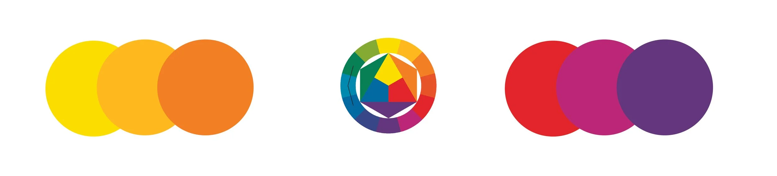
Analogous Colors are colors that sit next to each other on the color wheel. The colors are in sets of three hues. An example of Analogous is red, red-orange and orange. The similarity in the colors create a visual harmony in design.
Analogous (Colors)
Apex is the uppermost point of a letterform i.e. A, where two strokes connect.
Apex
The arm of a letterform is the stroke extending from a stroke or stem of a letter, which does not connect on either one or both ends. i.e. T, E and F.
Arm
Ascenders of letterforms refer to lowercase letters that extend above the x-height (see x-height definition). i.e. b, d, f, h, k and l have ascenders. The letter t may seem to have an extender but is not classed as an extender letter. I know it’s all quite tricky but hear me out. When you look at the letters side by side bdfhklt the letter t does not extend up to the ascender line like the others.
Ascenders
Ascent Line
The ascent line is used in typography. This invisible line refers to the very top of where a letter stops, sometimes referred to as the top line. This small gap above the cap line accommodates character apex, ascenders, top serifs and capitals that extend past the cap line such as O and C.
Aspect Ratio
Aspect Ratio references the proportional relationship between width and height of a design. i.e. 1:1 aspect ratio would mean that the height is the same as the width, the image size could be 500px x 500px or 1080px x1080px but the aspect ratio would remain the same as 1:1. A maybe more complicated example could be taking a 3:2 aspect ratio, this would mean that the width is 1.5 times longer than the height so the image size could be 750px x 500px or 2250px x 1500px.

Baseline
The term baseline is used in typography. The baseline refers to an invisible line text sits on. If you think of writing in a ruled journal, the rule line would be considered as your baseline, it just becomes invisible in design.
Brand Identity
Brand identity refers to visuals that represent a company or individual. This includes anything from the logo, fonts, color palettes and writing. Branding sets the tone of how a organization is perceived and a cohesiveness for ease of recognition.
Body Copy
Body copy is the main text in a design. Usually containing the bulk of information for the reader such as sentences and paragraphs. The body copy is separate from the title and subtitle of say an article.
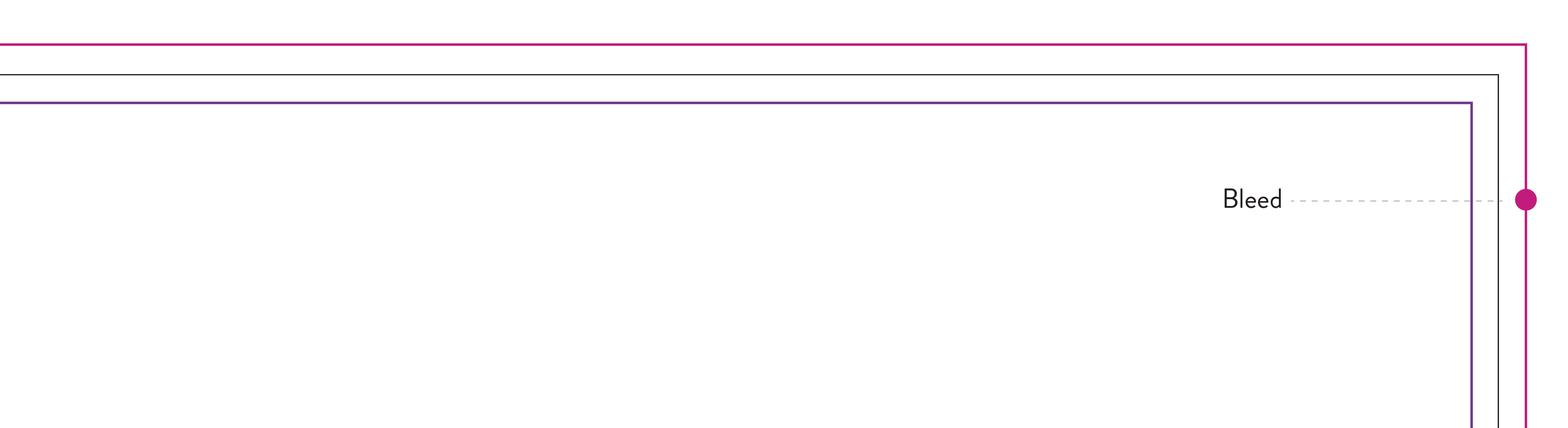
A bleed is created to a design made for print. The purpose of a bleed is if you have a design that should print edge to edge when the piece is trimmed it doesn’t show white space of the paper. The bleed ensures your background color or image extends to the edge if a cut isn’t exact. A standard bleed is .125” but can be made bigger for larger sized designs.
Bleed
Cap Height is used in typography, similar to the baseline but up top. The cap height refers the height of a capital letter. Though some capitals can span above the cap line such the apex of A or rounded letters such as O.
Cap Height
Character
A character is a letter, number punctuation mark or symbol. Character Set is a collection of characters belonging to a typeface and its selected weight. Character styles is formatting applied to text that can be defined and applied in a single click step.
CMYK stands for cyan, magenta, yellow and key (black), this color mode is used for print and creates a wide range of colors so is used as an industry standard. CMYK is subtractive which means it removes wavelengths from white light so the more colors you mix the darker the color gets.
CMYK
Contrast in design can be achieved many different ways such as through color, texture, weight, shape and layout. Contrast can be used to create a focal point in a design that will naturally draw your eyes to important visuals or information. Color contrasting is a great way to add more interest to design but should still be used with caution to not cause strain to the eyes or create an adverse effect and be off putting.
Contrast
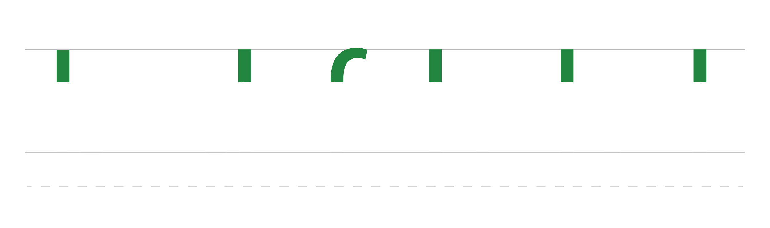
Crop marks are added at the save stage of your design. By setting up the initial design with the correct bleed and margins (see bleed and margins) the addition of crop marks shows the printer where the paper should be trimmed. The crop marks essentially look like crosshairs on all four corners of the design and are cut off with the paper trim.
Crop Marks
Complimentary colors sit opposite each other on the color wheel. The combination of two complimentary colors creates a high contrast on a design. Example of complimentary colors are purple and yellow. Complimentary colors can often balance each other out when used in the right hue.
Complimentary Colors

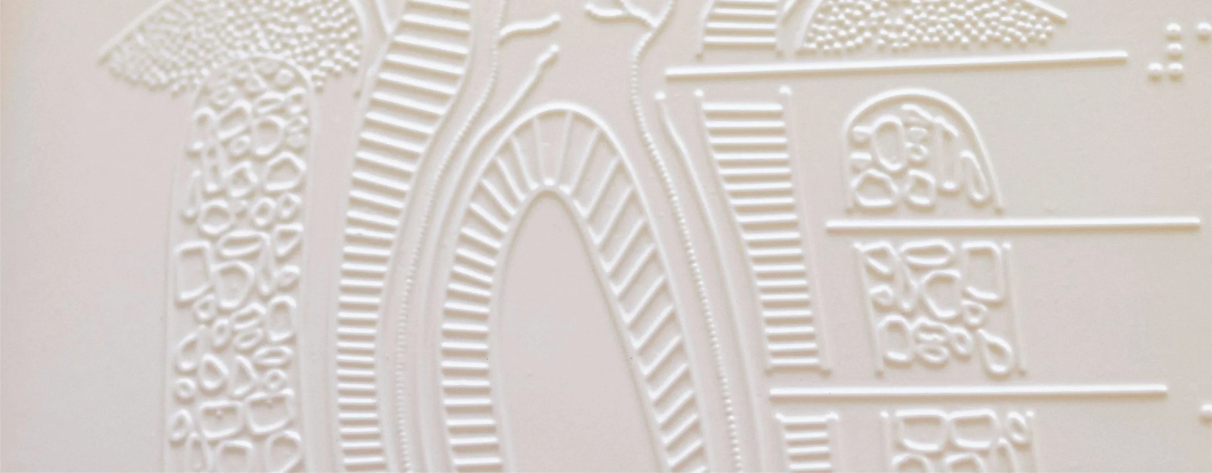
Debossing
Debossing is a technique that is used in the finishing stages of print. Debossing sinks or stamps the desired design section from the paper to create an extra visual and touch appeal for the end user.
Descenders are the counterpart to Ascenders. Descenders of letterforms refer to lowercase letters that extend below the baseline (see baseline definition). i.e. g, j, p, q and y have descenders.
Descenders
Die cut finish is a mass production method to have a design cut into a specific shape or a design/window cut into a design. Popularly used for sticker shapes or more intricate cuts to the center of a design.
Die-Cutting
Embossing is a technique that is used in the finishing stages of print. Similar to Debossing but instead of sinking the design embossing raises the desired design section from the paper. Both are equally great ways to create an extra visual and touch appeal for the end user.
Embossing
Fold refers to several different types of folding techniques applied to printed pieces. Folds are added to a design piece printed on one piece of paper then folded into equal size sections. Some examples of fold types are as follows but definitely not limited to: half-fold, Bi-fold, tri-fold, z-fold, accordian fold, gate fold and map fold.
Fold
Foiling or foil stamping is the process of adding metallic or colored foils to the surface of a design through heat and die application. Adding foils to a design can really make it stand out by catching the light or a potential customers eye.
Foiling

Grids are used while working on a design to provide accuracy, structure and accuracy. Grids are made up of horizontal and vertical guides to ease the process for the designer in the creation of a piece of work.
Grid
Hand lettering is the creation of custom words. Usually created for logo design to make the logo 100% unique or poster design for the title.
Hand Lettering

HEX colors are made up of a six digit combination of numbers and letters. For example white HEX code would be #ffffff. Designers and developers use HEX codes for CSS, HTML and SVG. The HEX code defines the mix of RGB (red, green and blue). HEX codes are universally recognized so can help to make sure colors are kept consistent across different devices and applications.
HEX

Hierarchy
Design hierarchy organizes elements of design by importance to lead the viewers eye through the design as the designer intended. Hierarchy can be achieved through positioning, scale and color.
Icon
An icon is a pictorial representation of an object, action, information or idea. An icon should be easy to recognize what it represents as the purpose of an icon is to convey information quickly.
Justified
Justified is used when referring to a block of text. Justified text is when the text aligns with the margin on the right and the left of the text frame. When text is justified there is no rag on either side (see rag definition).
Kerning
Kerning is the spacing between individual letters or characters. Adjusting the Kerning of letters within a word can help with the readability if the letters look too close or too far apart.

Leading
Leading (Ledding) refers to the space between lines of text from baseline to baseline. Adjusting the leading in a paragraph can increase readability and add much needed white space to a design.
Left-Aligned
Left-aligned refers to text. Left aligned text aligns to the left margin of the text frame with a rag to the right.
Logomark
A logomark is a logo for a company / individual that does not include any descriptive text such as the company name. A good example of a logomark is the Nike swoosh.
Logotype
A logotype or a wordmark is a logo with no pictorial display. Logotypes are usually stylized in a way to make the text unique so the brand name is easy to recognize. A good example of a logotype is Coco Cola.

The margin is a blank area that sits between the bleed and the design safe area. There are several purposes for the margin, it ensures content is equally framed, eliminates content cut off and creates white space to keep the design clean.
Margin
Mean Line
The mean line is the invisible line that marks the top of a lowercase letter. The mean line is essentially the top of the x-height
(see x-height).

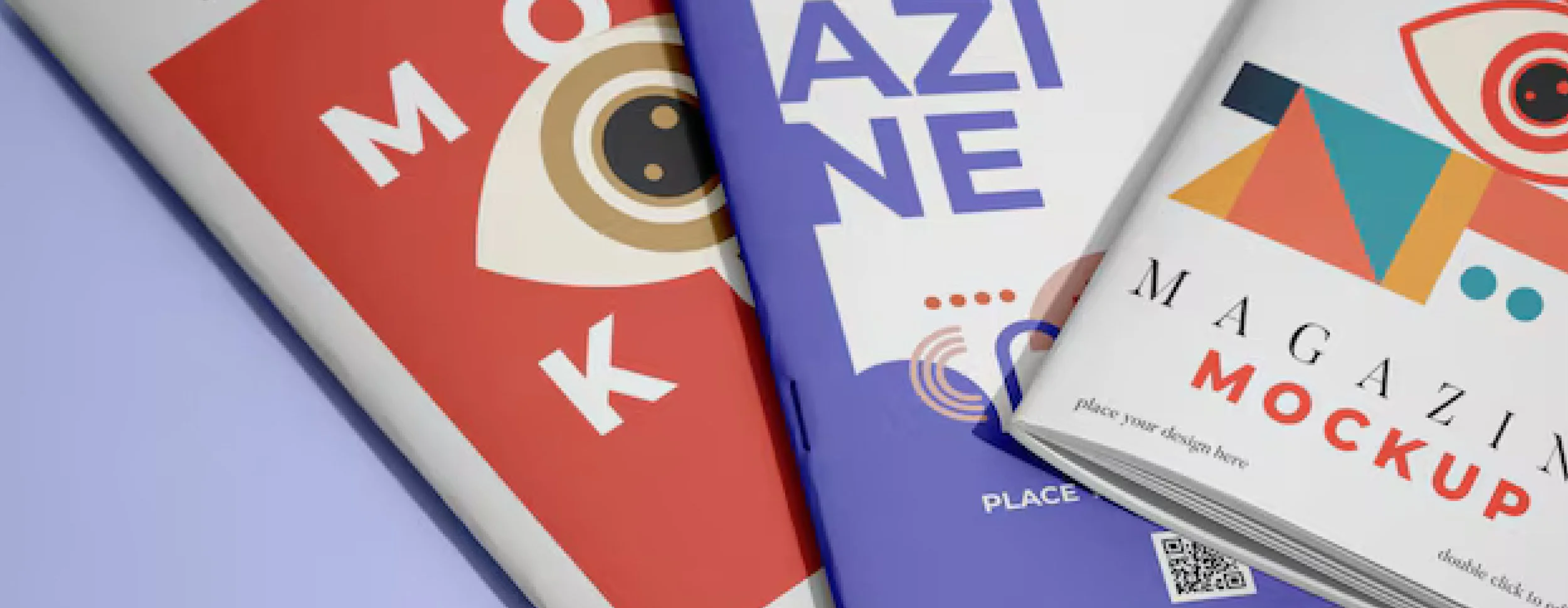
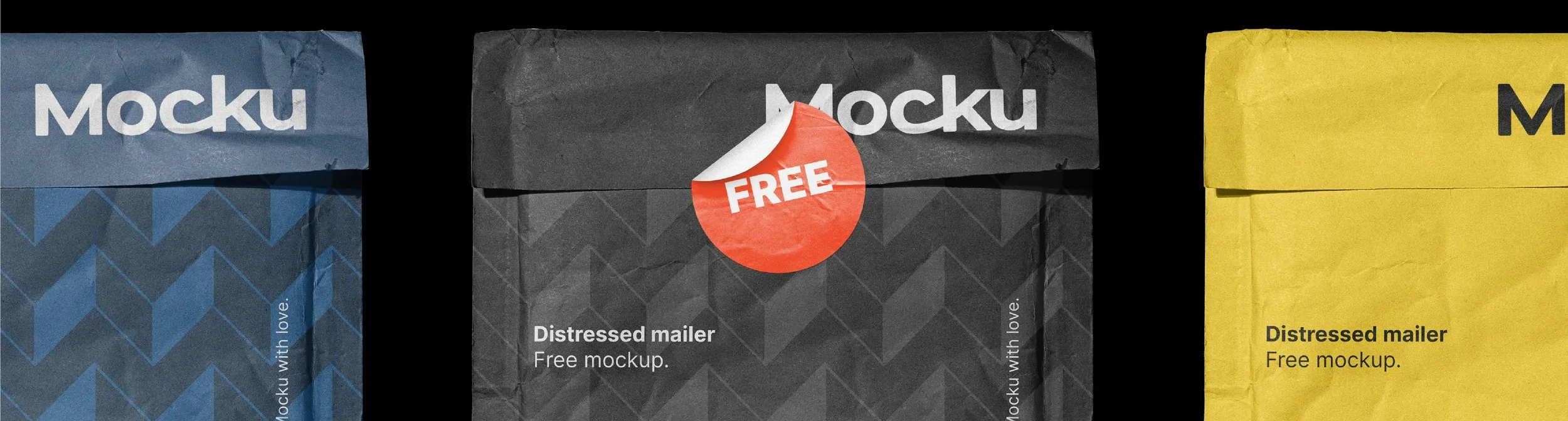
Mock Up

A mock up is a realistic visual representation of how a design will appear when applied on a tangible piece. For example when creating a t-shirt design a mock up alongside the 2D design may help the client visualize the end result.
Monochrome
Monochrome is a color palette concocted of different shades and tones of one single color used throughout a design.
Moodboard
A moodboard is created at the ideation stage of designing. Moodboards are a collection of visuals and ideas gathered by the designer to develop an aesthetic and inspiration for a specific project. Moodboards can also be used to convey an idea or concept to a client to show the thought process that lead to the designs being presented.
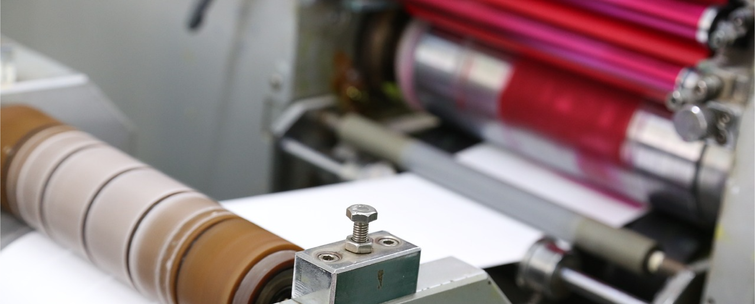
Offset Printing
Offset printing uses plates that transfer an image onto a rubber blanket that then rolls the image onto a sheet of paper. The ink is not transferred directly onto the paper hence the name offset.
An Orphan refers to bodies of text when space is limited. An Orphan appears when writing in columns. The first line of the paragraph will appear at the bottom of the page by itself with the rest of the paragraph displaying at the top of the page. An Orphan is the opposite to a widow (see widow).
Orphan
Palette
A palette refers to a color scheme created for use on a specific design or on all designs belonging to a brand. Palettes are generally made up of primary, secondary and accent colors that work harmoniously together.
Pantone (PMS)
The Pantone Color Matching System (PMS) is a standardized color matching system used all over the world, making it the gold standard to accurately and consistently match a color. Pantone colors are not just used by graphic designers but also in fashion design, interior design, product design, manufacturing industries and many more.
Proof
A proof also referred to as a printer’s proof, press proof or print proof is a sample of a printed design provided by a printer for sign off by the designer to ensure quality, accuracy and color are as intended. The proofing stage may be one of the most important stages for a designer, equally exciting and nerve wracking catching any errors before a piece is mass produced.
Perfect Bind
Perfect bind refers to how a book is placed together. Perfect bound books / brochure pages are bound with glue and then wrapped with a soft cover. Popular for soft bound books as a perfect bound book can handle moderate to high page counts and is also an affordable option that looks professional.
Rag
Rag or ragged edge refers to a block of text. The rag appears when a block of text is left or right-justified, the irregular edge at the end of each sentence is the rag. On center justified text there will be two rags on each end. There is no rag on justified text.
RGB
RGB stands for red, green and blue, this color mode is used for digitally displayed design. RGB is Additive which means it adds red, green and blue light together to create other colors on screen, so the more colors you mix the brighter the color gets.

Right-aligned refers to text. Right aligned text aligns to the right margin of the text frame with a rag to the left.
Right-aligned
Saddle stitch refers to how a book is placed together. Saddle stitch brochure pages are folded in half along the spine line and secured using staples. Saddle stitch binding is a cost effective way to bind pages.
Saddle Stitch
Sans Serif is the style of a typeface that has no serifs on the foot, head or arm of the character. An example of a sans serif font is Helvetica in comparison to Times New Roman would be a Serif style font.
Sans Serif

A score refers to scoring paper. The process of scoring creates a clean crease in the paper making it easier to fold.
Score
Screen Printing
Screen printing is a printing process that uses mesh to transfer ink to a surface. The negative space of the design is created by making the mesh impermeable to the ink.
Serif
Serif is the style of a typeface that has serifs on the foot, head or arm of the character. The serif is a small stroke regularly attached to a large stroke on a letter. An example of a serif font is Garamond in comparison to Futura would be a sans serif style font.

Stem
The stem of a letterform is the main vertical stroke. Capital L, T and F have one stem, whereas capital H has two. Lowercase letters also have stems.

Stock can have two meanings in design depending on the context its being used in. Don’t worry you’ll know which one is being referenced. A stock image refers to purchasable licensable photography or illustrations that can be used in designs. Paper stock refers to the quality and type of paper. The stock options include, weight (thickness), color, texture and finish. Choosing the right stock greatly effects the end result of a printed piece.
Stock
A style guide is created to set a clear set of guidelines surrounding a brand. A style guide can include but it not limited to: Logo display, color palette, icons, imagery and tone of voice. The style guide ensures that a brands assets are kept cohesive and when a piece is created that its clear it belongs to the organization or designer.
Style Guide
The tittle of a letterform is a small mark commonly seen on a lowercase i or j. Accents above letters for languages other than English are also referred to as tittles. For example Italian letters à, è, é, ì, ò, and ù accent above the letter is a tittle.
Tittle
Tofu, I know sounds strange but the explanation is simple. Tofu appears as a small empty rectangle with a cross through the center when a character or glyph can’t be found within a font. Somewhat of a graphic design phenomenon.
Tofu
Tracking is the spacing between letters or characters of an entire word or block of text. Adjusting the tracking of letters changes the density of how a word appears to give it a visual appeal or better readability. Tracking can be loosened or tightened.
Tracking
Triadic Colors
Triadic colors are three equally separated colors around a color wheel. Imagine placing a triangle in the middle of a color wheel, the triadic colors would be the colors that align with each point of the triangle. An example of triadic colors are orange, purple and green.
Trim
The trim line aligns between the outer edge of the margin and the inner edge of the bleed line. This line is essential for the printer to understand where the finished design should be trimmed. Crop marks can be used to indicate the line on the print ready document.
Typeface Design
Typeface design is essentially creating an alphabet in a specific cohesive font style. Typeface design can include: Uppercase, lowercase, numbers, punctuation marks and symbols.
Vector
Vectors are artwork created from lines, points and curves. Vectors can be scaled to any size without losing resolution, keeping the quality the same at any size. Vectors are created using Adobe Illustrator.
Wafer Seal
A wafer seal is essentially a sticker. The wafer seal is a self-adhesive disc used to seal envelopes, mailers and boxes for mailing to consumers.
Weight
Weight refers to the thickness of a font. i.e Bold, Black, Light, Normal.
White Space
White space refers to the spaces around and in between elements on a design. These spaces can be white or filled with color, but are essential to create breathing space around the designs main focal points.
Widows
A widow refers to bodies of text when space is limited. An widow appears when writing in columns. The last line of the paragraph will appear at the top of the page by itself with the rest of the paragraph displaying at the bottom of the page. A widow is the opposite to an orphan (see orphan).
X-Height
X-Height refers to the height of x within a font style. The height of x within a font sets the proportion for the font and effects the readability.